Lingua Bridge brand style guide
The building blocks of the Lingua Bridge identity: how the wordmark, color, type, and imagery work together across the site.
- Internal reference
- Keep it consistent

Logo and wordmark
The Lingua Bridge wordmark pairs a bridge motif with the company name set in DM Sans. Use the full-color wordmark on ivory or white backgrounds, and a reversed white version on cobalt or deep navy. Give the mark clear space on all sides equal to the height of the letter L, and never stretch, recolor, or add effects to it. On photography, place the mark on a calm area of the image or on a solid brand-color panel so it stays legible.
Color palette
Cobalt leads, deep navy grounds the text, terracotta provides a single warm accent, and ivory keeps the pages calm. Every value below is drawn from the live site theme, so the guide never drifts from what visitors actually see.
Palette reference

Cobalt / Primary
#2B4C7E. Primary buttons, links, and brand accents.

Deep Navy / Secondary and Ink
#1E3557. Body text, headings, and the footer background.

Terracotta / Accent
#C86B4B. Highlights, secondary CTAs, and small emphasis marks.

Ivory / Background
#F4F1EA. Page background and large calm surfaces.
Typography

Display: DM Sans
Headings use DM Sans in a heavier weight for a confident, modern voice.

Body: DM Sans
Body copy uses DM Sans at a comfortable reading size with generous line height.

Case and rhythm
Sentence case for headings, consistent vertical spacing, and no more than three heading sizes.
Imagery in use

People and outcomes
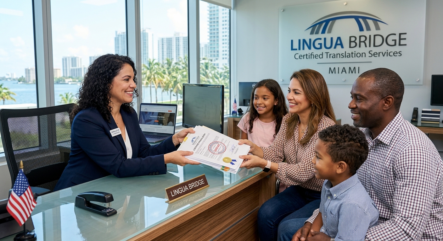
Real Miami settings and genuine expressions, never abstract stock cliches.

Professionals at work
Interpreters and translators shown doing the real work, warmly lit.

Trust and calm
Composed, confident environments that reinforce reliability.

Imagery direction
Photography is warm, professional, and grounded in real Miami settings: interpreters at work, families receiving accepted documents, and calm office environments. Favor natural light and genuine expressions over stock cliches. Images should show people and outcomes, not abstract concepts, and should always feel trustworthy and human.